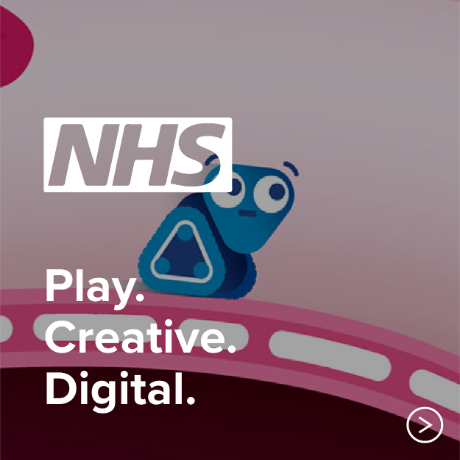
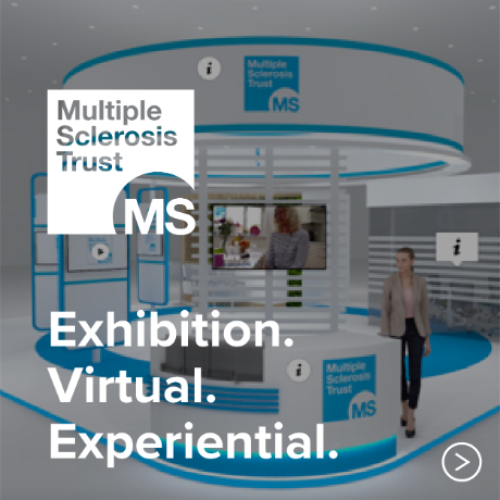
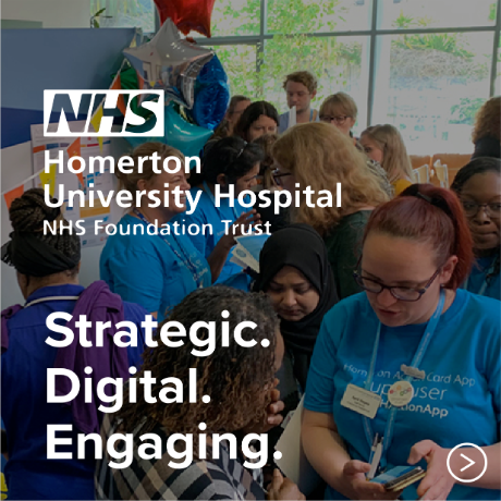
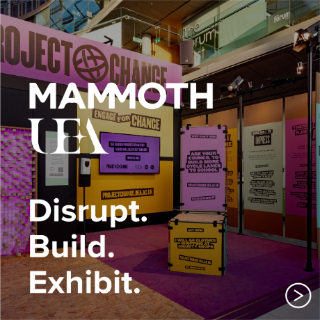
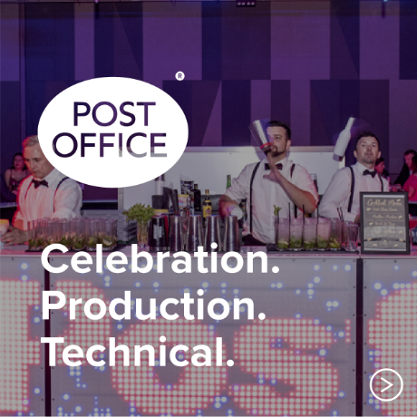
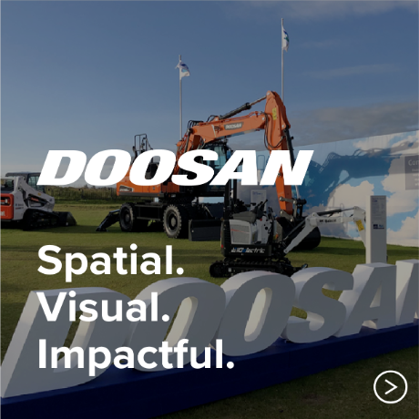
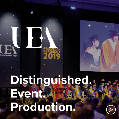
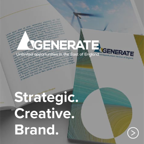
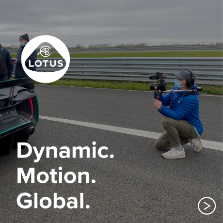
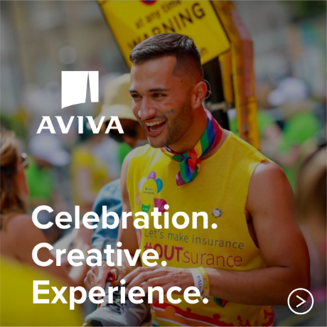
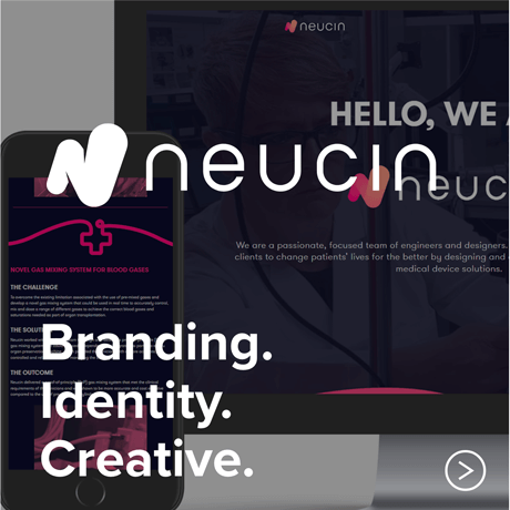
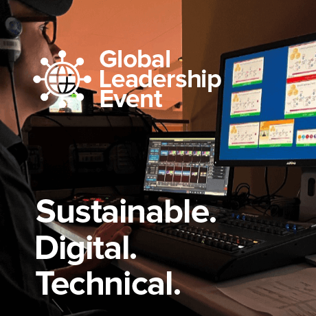
Crush
A brand good enough to eat.

The challenge

Crush foods are one of the largest local providers within East Anglia. Their team produces all their products in Norfolk.

Our brief was to create a visual identity and packaging for Crush’s range of foods and drinks. The brand will start by rolling out across a selection of oils, dressings, sauces, and cereals. The packaging must give you kitchen kudos, be something you’d want to keep on the shelf and not in the cupboard.

  • 1-Crush-Brand-Design-Logo
  • 2-Crush-Brand-Design-Packaging
  • 3-Crush-Brand-Design-Packaging
  • 4-Crush-Brand-Design-Packaging
  • 5-Crush-Brand-Design-Exhibition-Stand-Concept
  • 6-Crush-Brand-Design-Exhibition-Stand-Concept
  • 7-Crush-Brand-Design-Development
  • 8-Crush-Brand-Design-Chili-Oil
  • 9-Crush-Brand-Design-Sketches
  • 10-Crush-Brand-Design-Bento
  • 11-Crush-Brand-Design-Brand-Guidelines
  • 12-Crush-Brand-Design-Brand-Guidelines

The solution

During our initial discovery discussions, we soon realised the brand stamp needed to have a nod to its cold pressed rapeseed oil heritage. We wanted the food to be front and centre, and Crush to sit back. So, the brand stamp had to be bold and clean, for it to be made as small as possible on the packaging.

We also discovered that consumers bought these items for others, as much as for themselves, so came up with the idea of packaging the product as a gift. The simplicity of the front of the packaging, and the edible colours makes you want to pick it up and find out more. When you turn it around, the back stripe and repeat patterned background, gives that gift wrapped effect, making it hard to put down, and easy to put in your basket!

When we looked to defining the brand, the new logo for Crush started with the ‘droplet’ representing a drop of oil. We felt that this shape really helps tell the story of Crush. The drop shape doesn’t just represent oil, it also nods towards food in general, whether that’s the water that feeds the crops, the grains used in their cereal, or the petals and leaves on fruits and flowers. The drop provides the heart of the logo, its reflected in the letter styling giving the whole lockup a consistent, soft, playful look.

The illustrations we used within the brand are all hand drawn, we used a mix of textures and various line weights and styles. The imperfections of the illustrations help a handcrafted, artisan look. We wanted to make sure the style of the illustrations contrasted nicely with the clean lines of the logo, creating a well-balanced brand full of character and life.

The outcome

The new identity is being launched throughout 2024, the client is over-the-moon with the brand we have created, and which you can pick-up in a supermarket, deli or grocers near you.

Hall Farm
Gowthorpe Lane, Swardeston
Norwich, Norfolk,
NR14 8DS

+44 (0)1508 578 598
hello@productionbureau.com

Creative Office
The Dog, Main Road, Swardeston,
Norwich, Norfolk,
NR14 8AD

+44 (0)1508 578 598
hello@productionbureau.com

Scotland Office
Westpoint, 4 Redheughs Rigg,
South Gyle, Edinburgh,
Midlothian, EH12 9DQ

+44 (0)1314 401 570
scotland@productionbureau.com


© Production bureau 2024